Orbit’s visual identity should communicate precision, intelligence, and restraint. It should feel like a serious engineering institution rather than a temporary collection of glowing cards.

16.1 Visual language

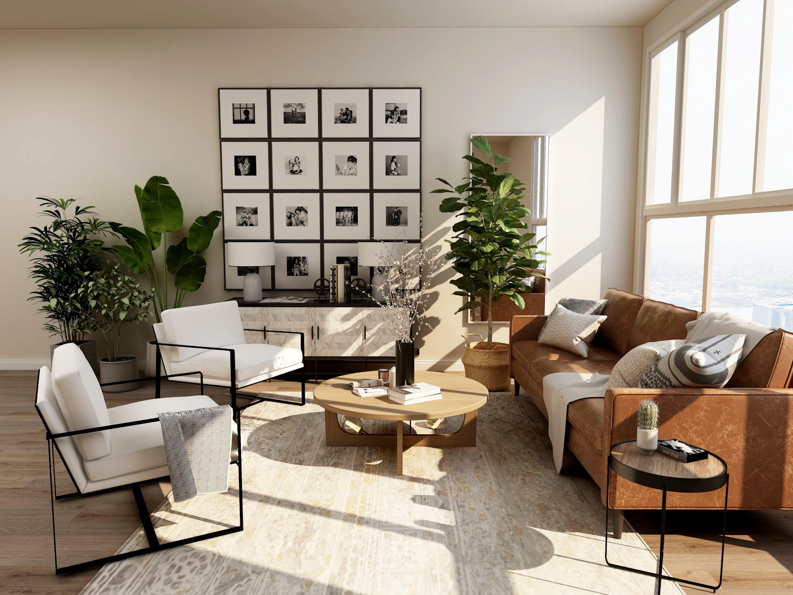
The preferred direction uses warm white, limestone, charcoal, graphite, and restrained metallic tones. Typography should be legible and deliberate. Layouts should use clear hierarchy, measured spacing, and a limited number of strong visual elements. The classical architectural reference is conceptual rather than literal. Marble, proportion, geometry, inscriptions, and monumental scale can suggest accumulated knowledge. Orbital diagrams, computation, and modern infrastructure can connect that reference to machine intelligence. Minimalist architectural interior with light and geometric structure
16.2 Motion

Motion should explain relationships or provide useful feedback. It should not slow navigation or make ordinary controls feel like a cinematic trailer. Respect reduced-motion preferences, avoid unnecessary parallax, and ensure content remains understandable when animation is disabled.

16.3 Product consistency

Marketing pages, documentation, the app, and developer tools should share typography, spacing, color tokens, icon style, and interaction patterns. Consistency should come from a reusable design system, not from copying the same oversized card into every page.

16.4 Authenticity

Use actual product screenshots and real interface states when describing shipped features. Use clearly labeled concepts for future devices and prototypes. Do not invent customer logos, staff biographies, performance statistics, certifications, or testimonials.